 Apps (short for applications) were introduced to the world via the iPhone in 2007.
In 2008, the Apple App Store was opened, and anyone could create apps. A market had opened that could generate developers enough income to give up their day jobs.
Now, there are two major app stores, Google Play (for Android apps) and the Apple App Store (for iOS apps). Together, they host close to six million apps. This is a massive growth rate in 10 years. And with the next billion users, it’s set to grow even more. Who are the next billion users? They are the next wave of users of the internet. They likely reside in third-world countries that previously didn’t have great infrastructure. However, countries within Africa, where users were previously unconnected, are becoming connected with the construction of 5G networks. This means that these users will need apps that cater to their own needs, wants, and entertainment values just as more developed countries have done over the last 10 years.
Since the creation of apps, development and distribution of these applications has become more complex. Their quality has improved, competition has become fierce, and the ways to develop them has become more diverse.
If you’re new to app development, I hope to give you a brief insight into useful information about apps and smartphones through what I call the A to Z of App Development.
App Store Optimization (ASO)
ASO was introduced to us via the Apple App Store in 2008, but it wasn’t regarded as an important business practice like its older sibling SEO until quite recently.
ASO means you are optimizing your app to be easily searchable in the app stores using specific keywords. Tools like Google Keywords exist to help you find the highest ranking keywords (which are the most searched for) within a certain category. By associating the keywords that are searched for the most with your app, you make it more likely that your app will appear in search results for users.
In order to add keywords to your app, you need to enter them into the appropriate field within the developer console profile of your app in an app store.
Bluetooth
Bluetooth is the wireless communication technology that allows a minimum of two devices that have been paired to connect and share data over short distances. This method is the most common way to connect audio devices with portable devices such as laptops, smartphones, and tablets.
It was invented by Dutch electrical engineer Jaap Haartsen in 1994 while he was working for telecom vendor Ericsson. Now, it’s commonly used by all companies and industries to connect their products.
Cross-Platform
When apps were first introduced, you could only develop an iOS app using Objective-C or develop an Android app using Java. This led to many developers specializing in one platform, and while it was good for developers to know the ins and outs of a single platform, it blocked them from reaching the user base of the opposing operating system. It would also double the cost of an app for those wanting to purchase the development of an app for both stores.
Now, there are a number of solutions that enable developers to code once and release to all stores. We call this capability cross-platform. There are two main ways you can create an app that’s cross platform:
- You can create an HTML5 app that allows you to code the app using web technologies like HTML5, CSS, and JavaScript. This is the wrapper that’s compiled into either platform’s codebase in order to make it run on the specific device.
- You can use a cross-platform tool like Xamarin or Unity and code the app in C# or JavaScript depending on the tool you use.
Cross-platform enables developers to become specialists (at a high level) in both platforms and reach more users. And, of course, it allows for the potential of more profit.
Devices
![]() In app development, there are currently three key devices to develop for:
In app development, there are currently three key devices to develop for:
- Smartphones
- Smartwatches
- Tablets
Smartphones, as I mentioned earlier, were introduced on a large scale to the world when the iPhone was released in 2007. Tablets came next, and again, Apple seemed to succeed in this wave of advances, even though Android tablets were available.
The apps for smartphones and tablets can be shared so the amount of work needed to develop across the devices is minimal. However, if you can, it’s a good idea to develop a difference between your smartphone app and your tablet app. (You may find that tablets should have a different layout to make the most of their screen estate.)
In 2015, Apple released the Apple Watch. It has several iterations, including branded editions like Nike and Hermès. Android watches have been released since the Apple Watch by companies like Samsung. These small devices, unlike tablets, cannot share the same app as smartphones. Because of their very small screens, individual apps (or one complementing your main app) must be created. Different interactions will be executed, and visual designs for smaller screens need to be considered.
Emulator
Emulators are software that allows app developers to test their app without launching it on a physical device.
Testing on physical devices should always be carried out when developing apps, but because of the fragmentation that exists across mobile devices, having access to all the different devices that your app can work on isn’t financially a good decision.
Emulators allow you to set up different versions of SDKs and device types for operating systems to test your app. In my opinion, you should physically test on a couple of the main devices that carry the latest spec and operating system version, and then use emulators to test the different variations.
Fragmented
Every year sees a new mobile operating system (OS), and because of this, there are a variety of operating systems for apps to run on. This broad range of OSs that are available is usually described as fragmented. Combined with the many devices available across each platform and their varying screen sizes, this means a lot of combinations that your app could possibly be used on.
Apple devices weren’t so bad for this in the beginning, although their variety has expanded since the original size was introduced. Android developers are the ones who need to make sure they perform a wide range of testing and lock down devices and OS versions that they do not want to serve with their apps so as to keep their testing to a manageable amount.
Gestures
With the introduction of touch-screen devices, gestures (e.g., single tap, double tap, swipe left or right, up or down) are now used just as much as digital keyboard buttons. Gestures help a user to interact more organically with a device than with digital keyboards or precisely selecting digital buttons.
Some apps like Tinder have become famous for their use of gestures within the app. These two gestures of swiping left or swiping right have become so synonymous with the reject or accept feature of Tinder that people only need to reference swipe left or swipe right in conversation for everyone to understand the reference.
Children as young as 1 year old are using tablets and smartphones better than their grandparents because gestures require no knowledge of language and are easy to learn.
As app developers, we need to keep in mind that using gestures instead of buttons to access functionality removes a high barrier to entry for users. And as gestures are easy to describe and learn, the user will be able to use your app faster and more effectively. This provides the user with a good user experience and will hopefully improve the number of users you retain after downloading the app.
Home Button
The home button (this could be physical or digital) is usually the only button on the front of smartphones. This button brings the user back to the first screen on the phone’s display. As an app developer, you need to factor in how your app will function if this button is pressed.
Icon
![]() App icons are small unique images that are used to immediately identify your app within app stores and on devices.
App icons are small unique images that are used to immediately identify your app within app stores and on devices.
They can look any way you want, but it’s usually a good idea to keep this icon within the same brand guidelines used in your app. It’s also good to depict something that represents the main function of your app so that users associate its use with your app icon.
Different stores have different guidelines for app icon graphics. Make sure you follow the correct guidelines for each store you submit to. This will ensure your release process isn’t delayed by having to redesign or recreate your app with different settings at the last moment.
JavaScript
JavaScript is a scripting language mainly used for web development. However, with the introduction of HTML5, JavaScript can be used to create complex apps with a web-based wrapper, so now web developers can create apps for mobile devices using the same skills used to create websites.
When you are thinking of developing your apps, you should consider which technology you want to use and which platforms you want to target. Using HTML5 can give you the benefits of developing using tools like Unity but without the same amount of complexity.
Keyboard
The keyboard is a versatile feature of smartphones. It can be changed to suit the language preferences of the user and even handle multiple languages being input at once (no need to switch between settings options).
The layout can also change to accommodate the user’s international keyboard preference.
Luckily, the user’s keyboard setting is usually something you don’t need to consider as an app developer. The keyboard will be displayed in the default language that you have set for your app.
Location
Apps use the location feature to identify where the user is. Facebook’s popular check-in feature uses the device’s location function to tag user posts with the location. Using location in conjunction with other features can provide more information to other users, and data to the app provider.
Magnetometer
Magnetometer allows your device to be aligned in relation to the Earth’s magnetic field. This means your phone will always be aware which way is North so the app can rotate to the correct position and orientation on digital maps.
Allowing your app to use the magnetometer requires a permission that you would need to allow when developing your app.
But, unless you’re making an app that requires this magnetometer functionality, like something that relies on geolocation or a compass app, this probably won’t be a permission that you regularly set up.
Notifications
 There are different types of notifications that devices use: local and push.
Local notifications can be set up during the development phase of your app and are sent to the user depending on the type of notification, i.e., an event notification or a reminder notification. The times that these are sent will relate to the type of notification. Local notifications can usually be managed by users themselves within a settings area of the app.
Push notifications are sent after the app has been developed; they are live notifications to the user from the app provider. These usually give up-to-the-minute short pieces of information to draw the user back into the app. For example, these can be news updates from the company behind the app.
Orientation
Two main types of orientation exist for devices: portrait and landscape.
Portrait orientation is when the device is aligned vertically, as in a sheet of paper, and a landscape orientation is when the device is aligned horizontally.
As an app developer, you can choose to lock your app to the portrait orientation or the landscape orientation or allow the app components to change position depending on the way the user is holding it.
Permissions
When creating an app, you can only do so much before the time comes to add a great new feature. In order to do this, you need to enable the relevant permission on that device. This is usually a check box or line you need to add to a config file.
This alerts the user when they download the app that your app will require the use of additional tools like access to your contacts or access to your camera.
As users are becoming more proficient at using apps, they are more aware of access to their privacy and personal data. Some apps may not be accessing personal or private data, but the permissions that your app requires in order to function fully will be listed whenever someone tries to install your app. Showing users this message prior to installing the app gives them a choice and makes them aware of how the app is using their device’s content.
Depending on the permission (and whether it is integral to the main function of the app), you may find that the app cannot be downloaded unless you accept this message or that the app’s features are restricted until you accept these permissions. It’s all up to the user to decide.
QWERTY
QWERTY is the name for the original style of keyboard used in physical and digital devices. The name was formed from the first five letters on the left side of the keyboard.
Depending on the input fields within your app, you may want to restrict what type of keyboard is shown to the user at certain times. For instance, restricting users to the numerical keypad in a telephone number field may help you reduce user errors.
The decision to switch out this keyboard or lock a field to a particular one is a design decision that you should make when designing forms.
Rotation
As smartphones and tablets can be used in both portrait and landscape mode, the ability to rotate your app is also something you should consider when designing and developing your projects.
Yes, giving the user the option to interact with your app on different orientations makes it more accessible, but this will add to the design and testing time. You will need to ensure that your app functions and looks correct in both views and that it can move between both seamlessly at different points through the user journey.
To make this easier, you may decide to lock the rotation on certain screens, but this restriction may seem inconsistent to users if they can rotate it on some screens, and it’s not totally obvious why they can’t rotate it on others.
Always keep the user, your project time, and testing in mind when considering rotation.
Resolution
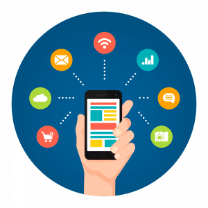 Resolution is the number of pixels that are able to fit on a device’s screen. As the years go on, we are introduced to mobile devices with even better screen resolutions, meaning that they can fit even more pixels in to give us a sharper, clearer and overall better picture from our screens.
Because of the fragmented landscape of mobile devices, when designing your app, it’s important to know the devices you target and the screen resolutions you will support. You will also need to make sure you test upon those. Differences in resolution can mean that objects positioned perfectly on the right hand side of your screen on one device may appear in the middle on others. Test for these differences, and develop solutions.
Status Bar
The status bar provides information to the user with icons. It can sit on or be hidden at the top of a device’s screen.
This bar shows users that there is something that an app wants you to be aware of and, obviously, the status of your device, e.g., whether the Wi-Fi is connected, whether you’re connected to a Bluetooth device, or whether you’re in airplane mode, all via icons.
If you use notifications within your app, think about an appropriate notification icon that fits with your app style so your user can identify it easily.
Touchscreen
Smartphones have been around since before the iPhone was launched. BlackBerry dominated this sector prior to 2007. These devices usually had a full-but-mini QWERTY keyboard, and the screen would take up the rest of the front. But the iPhone changed this. They showed that a full touchscreen was not only useful to users but also easier to engage with than tiny keys.
BlackBerry tried to launch their own range of phones with full-length touchscreens, but unfortunately for them, Apple already had their audience.
Touchscreen succeeded and was embraced quickly because of the low barrier to entry with gestures, great design, and onboarding process by Apple.
Because of this massive success in the change with how we interact with devices, more and more products like bank ATMs, POS systems in shops, etc., are utilizing touchscreen instead of physical buttons.
Although voice is now more widely used to communicate within apps on devices, using the touchscreen is still the primary source of input. This is because it’s easy for users of all ages to interact with. But it does depend of your audience’s level of experience with apps. So, as an app developer, you need to keep in mind that utilizing the touchscreen is great, but it needs to ensure that how you use it cannot be misinterpreted. For example, pressing and holding an object to interact with it isn’t something that you would naturally think of doing, while tapping is more intuitive.
USB Port
The USB port is always present on devices. It’s the primary way to charge phones, so it’ll always be a necessary feature until wireless charging takes off everywhere.
Micro USB was the dominant choice for Android devices (Apple always did their own thing), but now with the introduction of USB C, it seems that the world is waking up to the fact that we don’t want to have five different cables to charge five different devices.
USB C has been added to MacBooks and phones from both Apple and some Android phone manufacturers. So hopefully recharging will be a lot easier in the future.
So why’s this related to apps? Some apps can run directly on a USB device without the need to run on a device. And because of the portability of USB devices, apps can be device-agnostic and can run on pretty much most devices. A good example of when a USB app would be needed could be a support app for a company’s system administrator who’s upgrading all the computers and can’t do it remotely for whatever reason.
Some Android apps can be run from USB, but I highly doubt you’d have this flexibility with iOS apps.
Vibration
 Vibration (also known as haptic feedback) was introduced to mobile phones very early. In phones as old as the Nokia 3210 and in games like Snake, vibration occurred when the phone rang, or you’d get haptic feedback when you caught your object in a game.
Haptic feedback is a good way to provide non-textual or visual feedback to a user to alert them to something or a change in state. It shouldn’t be used everywhere or excessively. Ensuring that haptic feedback isn’t being overused within your app should also be considered when testing your app.
Wi-Fi
Wi-Fi is a technology that many devices like laptops, computers, smartphones, tablets, etc. use to connect to the internet.
As an app developer, you need to make a decision whether your app will need the internet to function or not. You may want to serve your app content from a content delivery network via cloud computing solutions, so your app may always need to be connected. Or, you may want to use a cloud database to store the scores for your app.
These are acceptable reasons, but it’s always a good idea to build in functionality that allows your users to continue using your app when the internet is not available. So, when it comes back, you can send up or retrieve data again seamlessly without the user’s session being disrupted.
Xamarin
Xamarin is a cross-platform tool that allows developers to produce apps written in C# with a predominantly shared codebase across multiple platforms.
Using Xamarin tools allows you to create native Android, iOS, and Windows apps with native user interfaces. This gives developers the ability to create apps that the users will pick up quickly due to being presented with a UI that they are used to.
However, if you want your app to look consistent across the platforms, you can override the native rendering and implement custom renderer for individual components.
Yearly Releases
Every year, Apple and Google update their iOS and Android operating systems, so it’s important to be aware of the changes that these updates will bring and how they will affect your current apps in the stores and future apps.
For example, with the release of iOS 12, starting in March 2019, Apple is making it mandatory that all new apps and app updates for iPhone, including universal apps, will need to be built with the iOS 12 SDK to be able to support their new iPhone XS and iPhone XR, but especially their iPhone XS Max.
Make sure you get notified or keep up to date with these changes so your app project timescales won’t be negatively affected.
Zones (Time Zones)
(OK, I cheated on this one, but it was really hard to find something related to “Z”).
Time zones can be important if you have specific timed events that trigger notifications within your app.
 Depending on where the user is, you may want this to trigger locally to them. Or, you may want this to trigger at the same time everywhere. You may want to consider where the majority of your audience resides so if you do choose the latter option, the majority of your users can enter your event at the same time.
This will need to be considered during design and development. Make sure you also think about a good way to test that this works!
Now You Know Your ABCs …
Apps have been around for 10 years now, but they are going to be around for a lot longer. It’s important to know the basics and background of what you’re working with so you know where you’re going.
If you’re new to app development or if you’re continuing to add to your app portfolio, I hope this has provided you some useful information so that you can build great app experiences.

