There are over one billion people globally who are living with some form of disability. For example, about 285 million individuals are visually impaired, according to a report made by the WHO (World Health Organization). With such significant numbers, it is important that the mobile web becomes more accessible to people with disabilities.
Some measures have already been taken and implemented. The existing Web Accessibility Initiative, developed by the World Wide Web Consortium, defines accessibility standards that include “mobile accessibility.” While it is still further developing more specific and updated standards and guidelines for mobile accessibility, the W3C WAI addresses the problems of accessibility for people using a wide range of internet devices, including mobile phones, tablets, and TVs.
The desire to connect and interact with the world becomes stronger as the technology evolves in leaps and bounds. Simple tasks, such as making restaurant reservations, buying movie tickets, and completing daily tasks, have evolved to require individuals to be online or have an online identity. Mobile accessibility is more important for users with disabilities, as using their mobile phones to connect to the internet should not come with limitations.
As much as possible, users with disabilities should be able to experience the internet to its fullest potential. Discovering and implementing viable solutions to achieve this end is what makes mobile web accessibility far more valuable than once thought.
Why is Mobile Accessibility So Crucial?
We are now in an era where there are 125 million consumers who own mobile devices and (rely on them to shop) in the US alone. For most, mobile phones are built to perfectly suit their needs, but as developers, we mustn’t neglect or ignore the fact that there are people whose disabilities prevent them from maximizing the use of mobile phones.
Experienced mobile app designers and developers incorporate web practices in their mobile-accessible websites, and these habits are concurrent with trends and the emergent technology. However, some of these engineers still make the same mistakes made by web developers a decade ago, like designing websites for a specific type of mobile phone brand, rather than catering to a universal audience. Focusing on just one mobile brand is not advisable, as more and more people are now using their mobile to access the internet, and there are various mobile brands with its own operating system, such as an iPhone with an iOS and other mobile brands with Android as its OS. Developers realized that their websites need to be accessible by a wide range of users; that way, disabled users can easily use their mobile phones as devices to help them experience a virtual, 3D environment.
Mobile websites utilizing best practices for mobile accessibility across brands share the same goals and strengths with accessibility-enhanced websites. These include the following characteristics:
- web design must be modest, with an intuitive single-column interface that follows the same navigation and layout that are normally seen on their mobile websites or apps;
- The content must be brief and on-point;
- Website pages must avoid the use of large images, in order to improve load times;
- Navigating around the website must not rely on hovering mouse clicks; and
- The content must be geographically relevant to the visitor’s location, if possible.
How to Make Your Website More Mobile Accessible

Here are 9 tips you can follow to ensure you’re creating an accessible website.
1. Check your current mobile web accessibility
Checking your current mobile web accessibility can be done using screen and visual reader tests. Key questions in your checklist may include the following:
- Are there any options to increase the size of the text?
- Does your app have an option for further accessibility or a way to gather feedback and comments from your users about the accessibility options?
- Does your app work in both portrait and landscape screen orientations?
- Is there help or a link to more information that can be easily found on your app?
- Are there any instructions or important features that have to do with colors?
- Are your buttons or icons large and widely spaced enough for a user to press them without accidentally hitting the wrong ones?
- When testing the screen reader, does your app understand words that are being spoken?
- When testing the screen reader, are actions executed easily without having to see the screen?
2. Produce and publish an accessibility statement
An accessibility statement presents precise information about the targeted level of your website’s accessibility and the process made to achieve said targets.
The reason for you to produce and publish an accessibility statement is to show your commitment to it. Though having this is not mandatory, it is advisable to include this on your website because the statement defines your commitment to making your app accessible to all possible groups of users.
Stating that you are working on improving the accessibility and usability of your app’s functions and parts enables, you are to categorize, prioritize, and create a list of the changes and solutions you need to make. Asking for feedback from your users will help you gather the information you need to make improvements.
Your accessibility statement must be based on the Web Content Accessibility Guidelines WCAG 1.0, and it should also be a part of your app description on the app store.
An example of an accessibility statement is: “This (website) is committed to providing a website that is accessible to various audiences, regardless of their ability or the technology they use.”… and so on.
It should include:
- A statement that your app had been designed and developed to be accessible.
- Features within your app that improve its accessibility.
- Links to documents that have the ability to describe the features of both your hardware and operating system that can be used to improve accessibility.
- Limitations of your app’s accessibility.
- Link for your users to submit feedback.
3. The importance of your website’s color, contrast, and visual hierarchy
Visual hierarchy describes which elements on your website dominate the audience’s attention and draws their eyes most.
The main reason why your choice of color scheme is vital is because there are people with color blindness or poor vision, and these conditions decrease their sensitivity to certain colors and the contrast between different colors.
You must create a website or an app that is easily readable through the smart use of colors. Use colors to highlight information and details. It is also important for links to show their intended purpose.
For the benefit of users with low vision, the use of boldface and underlined links will be easier for them to see. In addition, color-blind individuals need plenty of contrast between colors, so place light elements against dark backgrounds to make them stand out.
4. Adapt more interactive UI (User Interface) elements
An effective way of getting feedback from users is through the use of interactive UI (User Interface) elements, such as clarity and context within, and gestures and cues. The UI elements must look different from the static content being shown on the screen. This improves the user experience for those who cannot see them, as well as those who might encounter problems, through having impaired arms and hands, that make the kind of movements needed to complete a certain action on a mobile app impossible.
Testing out these gestures in the prototyping stage is a crucial part of web and mobile development. There are a lot of prototyping tools, such as Sketch, Invision, UX Pin, Noun Project, and Pixate, that can offer you various effects. These tools allow you to implement animations and transitions to assist you in adding functionality to your app.
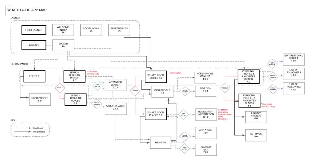
5. Make sure you have a sitemap

Make sure you include a sitemap to effectively increase the accessibility and usability of your website. The sitemap offers a comprehensive overview of your website’s logical structure. It also includes all of the important links and sections in a serialized form.
Sitemaps also make it easier for users to navigate your website. In addition, having a sitemap not only helps your users find their way but also it boosts search engine optimization by giving your website enhanced visibility on the internet.
6. Screen reader experiences should be clear and relevant
Screen readers are software programs that identify elements displayed on a screen and then repeat the information back to the user through spoken words or braille output devices.
Screen readers that rely on spoken words to interact with a device must be clear and relevant. Information that is generally seen on the screen, such as such as descriptions, sliders, buttons, icons, and other objects, must be in a logical order.
In addition, screen readers also convert digital texts into speech, which empowers users to navigate and hear your website content with the use of a keyboard. This assists your vision-impaired users and allows them to engage with your website with the same efficiency as others would.
7. Utilize a semantic markup
A semantic markup, or semantic HTML, is a textual equivalent for images, and it also creates meaningfully named links. It helps visually impaired users to use the text-to-speech software or the text-to-Braille hardware.
Using of semantic markup will help you write and describe the codes easier. You need to keep in mind that utilizing a semantic markup is vital in a website because the contents displayed and the structures of how it was made are important. Ensuring that your HTML (HyperText Markup Language) is both functional and valid is just one thing, and by using the correct tags, you can help your website content become more relevant to browsers and search engines.
Developers must keep in mind the needs that web mobile accessibility needs to address, like visual, motor, mobility, and auditory impairments.
Your website and mobile app accessibility tools will greatly benefit from semantic markup. Your users’ browsers can better understand how best contents should be presented to them. This will be most useful for users who require the help of screen readers.
8. Embedded video should have captions
Your captions must be perfectly synchronized with your embedded video content. Also, be sure to provide equal information to what is on the audio track by having a transcript for the media, and, most importantly, making it accessible to all digital devices.
Voice captions come in two forms, known as open and closed captions. Open captions are directly embedded into video contents, while closed captions have the option to be turned on and off, and are separately included as a track in a piece of video content.
9. Perform a user test
At every important step in the process, you must always remember to perform a user test, where you can have a beta test on how your site’s mobile accessibility works. It will help you determine and understand various functional limitations and flaws your users may encounter; it’s important that you know what sorts of problems they might be dealing with.
One of the most valuable ways to understand your users is by interacting with them. The use of user testing at the start of the prototyping stage of your design process allows you to gain a better understanding of the capabilities of your target users, especially those who have visual, hearing, and mobility limitations.
Mobile devices differ from computers because they do not have a default keyboard and have a smaller screen functioning as an input device. These features give your users challenges in terms of how they interact with their mobile devices and, ultimately, your website. This is another reason why user testing is important to come up with better mobile web accessibility.
Perhaps you have family members and friends who benefit from mobile web accessibility. Or maybe there are further improvements you yourself would like to experience in terms of mobile web accessibility.
Mobile web accessibility also helps enhance the facets of an efficient and successful online presence for your website, including but not limited to conversion optimization, increase in traffic, and user engagement.
Having improved mobile web accessibility is the foundation for an excellent and proven great user experience. Creating a website that is accessible to desktop computers, laptops, and mobile phones will help users with disabilities to maximize the benefits of using their mobile phones.
With mobile technology becoming universal in society, it is important that your e-commerce business is accessible because it has revolutionized the way consumers are using the web – and this is especially true for disabled consumers who are using mobile devices to make it easier and more convenient for them to shop.


