I imagine the fact that you are reading this means you care a little about the UX and UI of your application, and know they are not the same thing. For those of you on the fence, let’s go through a quick exercise.
Say you were interviewing candidates for a job. What is your first impression the moment a guy sits down with a stained t-shirt, unshaved, and uncombed hair.
I’m betting your first question is something like: “Did the recruiter even vet this guy before sending him to you”. Why do you think that? Because you are making assumptions. You are assuming this guy is not taking his job seriously and probably wouldn’t do a decent job if you hired him.
You are thinking that if he is sloppy with his appearance that he is probably sloppy with his work. Why do you think that? Because experience tells you that most of the time it’s true. Not always, but a good portion of the time.
Should you judge a book by its cover? No, of course not, but we all do.This is mostly because we don’t have time to dig deeper. How many times have you decided whether to read an email based on the title? How many times have you clicked on an article because of the thumbnail?
Hopefully those titles and thumbnails are a relevant depiction of the content. But the point is, you won’t know that until you read it. You are not going to read every single email and article that comes your way. Instead, you are going to make a judgment based on the little bit of information you have.
And that is why the UI of your application matters. The first time a user sees your application you want to win them over. You want to ace that interview. You want them to give you a shot. It’s your first impression and, in a lot of cases, it’s going to determine whether you get a chance at a second impression.

In this article, I’m going to touch on the difference between UI and UX and why it matters. So far I’ve been talking about UI. Now that term has taken on a bunch of meanings these days, technically it means “user interface” so it kinda relates to anything you see, but when I talk about it here I’m referring to the look of your app.
The main reason UI is important is that people make snap judgments. If your application is ugly, people will assume it sucks and not give it enough of a try to find out otherwise. Similarly, if your application looks great, people will assume it will function. At the end of the day, the look will only carry you so far, so it still has to be a good application. However, if it also looks good it will take less convincing to get people to try it.
If you take the time to make your application look good, people will assume you took the time to make sure it works well.
What if your application is an internal application that users have no choice but to use it?
Appearances still matter. Remember this is about people making snap judgments about the application. The people you want to impress are everywhere. They’re even in your own company and, if you impress them, you could secure you next job.
In fact, in a lot of these cases, it has even more of an impact because a lot of these people will have little to no hands-on experience with the application, so it’s even more true in their case that they will be judging the application based on how it looks.
So let’s say I’ve convinced you. That still leaves the question of how you improve the UI. After all, you are not a designer. It’s one thing to know UI is important, but it’s another to know what to actually do to make it look better. The good news is there are some easy wins, and I will touch on them later on, but before I do, I want to touch on UX and explain the difference between UX and UI.
What is UX and how is it different than UI?
We’ve said that the appearance of the UI is about making a good first impression. Just like at a job interview, your appearance get’s you started on the right foot. But that’s just the beginning, that’s just to get you to past the initial stage to the real interview.
In keeping with the interview analogy, UX is when you open your mouth, start talking, and interacting. UX is about feeling like you like the person, that you understand each other, and that you are going to enjoy working with them.
In short, it’s the experience. That’s what the “X” in UX stands for: user experience.
The most fundamental part of creating a positive user experience is ensuring that the user can figure out how to use your application with as little training as possible.
The more a user is able to quickly accomplish what they want without having to ask someone or look it up, the better. That’s really the core of it.
Put another way, your application has to be intuitive:
in·tu·i·tive
Using or based on what one feels to be true even without conscious reasoning; instinctive.
That’s great, but how the hell are you supposed to know what’s intuitive? That’s the best part of designing the UX, you can’t. The definition above even says “without conscious reasoning”. You can’t “know” it, but you can find out.
Trust me, once you learn how, you won’t be able to help but see it. It will jump out at you.
In most places, the process for delivering a feature goes something like this:
A feature gets worked on for a while. When it’s done, the user is told about the feature, how it works, and how to use it.
At some point, the user tries it out. If they don’t understand something, which is most of the time, they reach out to someone who worked on the feature. They talk and fiddle around until the user gets it. In some cases, this cycle can even happen multiple times with the same feature.
Now at the end of the day, there is nothing wrong with this. The user got a new feature and in the end was able to use it. Assuming the feature was valuable to begin with, everyone wins.
Just because the feature works doesn’t mean it’s providing a good UX. There’s always UX, the user always has “an experience” of some kind. In the example above, the experience for the user was: they got a presentation, they talked to several people, and after a lot of talking and tinkering they finally figured out how to use the feature.
The difference between the experience I just described and the concept of “good UX” is that “good UX” minimizes the amount of time, people, and overall effort involved in learning to use the feature.
As customers, we’ve all experience both “good” and “bad” UX. You buy something at the store, take it home and it just works exactly the way you expected right out of the box. Apple built its empire on this experience.
We’ve all also had the exact opposite experience. We bring a product home, we try to get it to work, press every button and turn every knob we can find. If that doesn’t work, we turn to the manual. We don’t even read the whole manual, just enough to go back and press more buttons. If it still doesn’t work, as a last resort, we call support. If it still doesn’t work (God help them), we’re never buying a product from them again.
I think it’s obvious to say that the ideal experience with any product is that you get it, it works exactly how you expect, and it delivers the results you want. That’s good UX.
The closer you get to that, the happier the user will be, which has practical implications to you: fewer support calls, less training, and satisfied users. If there are competing products in your market, it can even be a competitive advantage.
For all these benefits, you only have to learn a couple of UI/UX skills that will serve you forever.
How you can improve your UI
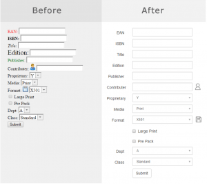
There are a couple of quick, simple techniques you can use to make your UI better. The most common issues UIs suffer from is visual clutter. In most cases, the things that help the most are to align and reduce.
Aligning will make your UI look neat, the same say that tidying up around the house, tucking in the dining room chairs, and aligning the welcome mat with the door makes your house look neat.
By reducing, I don’t necessarily mean removing controls from the screen; though, that’s something you should definitely consider if you can. What I’m referring to is the quantity of any visual element, like the number of colors used, or the number of text stylings, like bold and italic—basically anything you can see and identify as being different.
The more “things” you have, the busier, more cluttered, and more complex it appears.
Here are some things you can do:
Align for Neatness
- Align the starts and ends of controls and content
Reduce for Simplicity
- Reduce the number of colors
- Reduce the number of icons
- Use icons with fewer colors
- Reduce the number of text decorations (e.g., bold, italic, different font sizes)
- Use a “clean edge” font (e.g., not Times New Roman)
- Use light or dark colors instead of primary colors (e.g., dark or light red instead of pure red)
- Use a flat design (e.g., remove visual “noise” / extras like shading for bevels)
- Use blank space instead of blank placeholders (e.g. “…” or “–“)
- Combine controls (e.g., instead of a label with a button next to it use a “link” instead)
- Use controls that reveal extra visual elements on hover or click
Like everything in life, making the changes above won’t always be the right thing to do in your situation, but they will apply the majority of the time.
How you can improve your UX
Unlike UI, UX can’t easily be boiled down to a list of common changes to your application. Good UX is more about paying attending to the people using your application in a very specific way.
Above, I gave an example of how features are commonly given to users. Let’s go through that again and break it down to see how we can do things differently. Again, the typical process looks like this:
- A feature gets worked on for a while.
- When the feature is done, the user is told about the feature, how it works, and how to use it.
- At some point, the user tries out.
- If upon trying it, the user doesn’t understand something, they reach out to those who worked on the feature. They talk and fiddle until the user feels like they understand.
What’s wrong here is that the opportunity to improve the UX was completely missed. Remember when we looked up the definition of intuitive? Something is intuitive when it behaves the way the user expects it to.
Never in this process did we check to find out what the user’s expectations were. Sure, you can argue that that was done when the requirements for the feature were gathered. But it probably wasn’t.
What was probably discussed during requirements gathering was the different ways that the feature could be implemented. And maybe the user was given the options and asked to choose which approach they liked best.
The problem is that the designer assumed the user knew what was intuitive to them. As I mentioned before, they don’t. The definition of intuitive bears repeating: intuition is not a conscious act. You can’t ask someone what’s intuitive for them.
So how do you find out what’s intuitive if you can’t know, and you can’t ask? You ask them to perform the task, but DO NOT TELL THEM HOW to perform it. Faced with having to figure out how they would perform the task, they will turn to their intuition. Their gut reaction.
They will start clicking on different part of the applications, probably in ways that you would never expect. As they do this, you can ask them, why did you go to that menu? Why did you click there? What were you expecting to happen when you did X?
Don’t be surprised if they become completely stuck: it happens all the time. If you’re like me, it will hurt to see them struggle to use the feature you worked so hard to create. Don’t take it personally.
Most importantly, RESIST the urge to help them along. This is a lot harder than it sounds.
If they turn and ask you how to do something, turn the question back to them and ask how they think they should do it. If they think you are being cruel and taunting them, explain that you are trying to make the interface better, their confusion is not their fault, and that the session has been very valuable to you.
At some point this process might become pretty futile, as they might not be able to make it work at all.
At that point, you have a couple of options. You can ask them to perform a different task so that you can evaluate a different feature, or you can give them a hint that will get them a bit deeper into the feature, so you can evaluate its other aspects. Just don’t give into the urge to do that too prematurely.
As all of this is going on, you want to make a note of all the places they clicked, all the things they tried, and what their thinking and reasoning was for trying those things.
What’s nice about this process is that you will undoubtedly leave the session with several ideas on how to improve the UX. Just make sure you don’t fall into the trap of not testing your solution. After you make a UX tweak, you should go through the process again, ideally with a different user.
I guarantee if you do this, at the very least, your UX will be substantially better.
Good Code Isn’t What Gets You Paid
The developers landing the senior roles and the consulting offers aren’t better engineers than you. They’re known. RDU is John’s coaching program for developers who are done being the best-kept secret on the team.
Book Your Free Call →
Related Articles

Steps to Follow during IoT App Development—Its Ultimate Business Value
Companies who dream of staying ahead of the competition look for ways to achieve the aspect faster by inculcating innovations.…

Best Practices for Mobile UX Designs
As per a report compiled by Statista in 2021, the number of mobile users worldwide stood at 7.1 billion. It…

How To Create a Dating App Like Tinder
Dating apps not only bring many individuals a step closer to their dating partners and potential soulmates, but they are…