 A few years ago, Chanty’s team faced the following situation: We’d done a good job with our product, an alternative to Slack and easy-to-use team chat, and we expected thousands of active users.
Then we opened our analytics tool and discovered that we were failing to convert users the way we expected—they were leaving. Months of developing, testing, and tweaking our team chat seemed to be wasted.
What could have gone wrong? The answer was a no-brainer: conversion and retention could be improved with a thought-out customer onboarding process. This is the trap many startups fall into: Being unaware of the impact onboarding makes, companies lose their users instead of getting expected recognition.
Luckily for Chanty, this story has a good ending. And in this article, our team will share our advice, tips, and strategies for those who need help crafting their onboarding process. Let’s dive right in!
Analyze Your Competitors First
The first step is simple, yet useful. Analyze every part of your competitors’ onboarding flow. Think of it as the necessary preparation stage. What best practices can you learn from them? As our startup is a Slack alternative, we looked at Slack’s onboarding pros and cons.
We have noticed that their onboarding flow had evolved. A few cool improvements include the following
- Now, new Slack users don’t need to create a password during the signup process. It’s a great idea in terms of conversion rate because it shortens the user journey.
- In-app tooltips are brief and informative.
- In 2016, Slack made the account creation flow more dynamic and personalized.
Nevertheless, Slack’s onboarding emails remain spammy and messy. This was the thing we decided to improve: dramatically crafting Chanty’s onboarding process.
Components of a Good Onboarding System
Let’s start from the very beginning: The onboarding process is the ongoing relationship your users have with your product. In other words, using your product should turn into users’ new habits. The bad news is that building habits can be hard (remember how it is difficult to start learning a new language or going to yoga classes consistently).
Here comes the question: how to build the habit and create a truly engaging onboarding? We decided to onboard, educate, and support every new user as much as possible during their initial weeks. What gave us strength? We just knew what we were fighting for:
- We wanted to stop users from dropping off.
- We wanted to understand the reasons why our prospects were struggling with Chanty features.
- We wanted to know the steps where they got frustrated about our team chat.
- We wanted to segment our users based on their behavior.
- We wanted users to upgrade to the paid tier.
- And so forth.
Looking ahead, a single welcome email is not enough for all the above-mentioned goals. Your relationships with users start from the very first step of signing up for the service and … never end.
However, please don’t rush to get everything at once! Speaking of our experience, we have not had enough time and resources to cover all the aspects of onboarding. When you are just starting your journey to the excellent onboarding flow, there is a “minimum onboarding pack.” It carries out two main tasks of onboarding flow: It introduces new users to your product and motivates them to stick around for the long haul:
- Signup and welcome email to greet new users on their first login and encourage them to take the first step in setting up their account.
- The product tour to guide users toward their “aha” moment and showcase high-value features.
- A few transaction and educational emails to turn new users into loyal ones and convert them into paying customers eventually.
- Documentation (it’s optional in the first instance).
In a nutshell, our initial onboarding flow considered true users’ goals. We focused on what they wanted to achieve. In other words, we forgot about highlighting Chanty features and did our best to help users reach outcomes as easily and predictably as possible:
- We offered users a clear and straightforward roadmap.
- We sent consistent reminders.
- We kept useful resources for potential sticking points ready for users.
Let’s take a deeper look at how the user onboarding process has begun for Chanty.
Create Simple Signup That Triggers Emotions
Every onboarding experience starts with signup. During the signup process, you begin the relationships with users and gather useful information about them. With so many tips out there on how to make the perfect signup flow, there is still no “one size fits all” solution. The truth is, a simple 1-click signup doesn’t impress anyone anymore. Now it’s all about creativity that triggers emotions. To create a habit-forming application, you should link your product to the users’ daily routines and emotions.
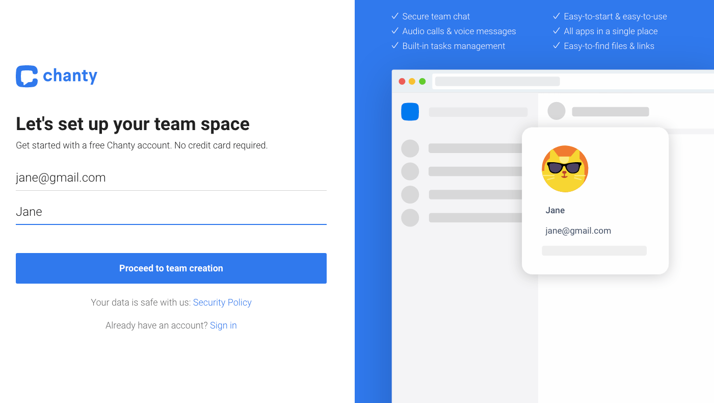
Have you noticed a short bullet list in the right corner? We complimented the Chanty signup form with the perks the user will get using your tool. That’s positive reinforcement that the user is actually signing up for something great. So don’t hesitate to compliment your signup form with the perks the user will get using your tool.
Also, we were trying to keep signup as simple as possible. So, our signup form did not ask users to leave too much information. In our team chat, we are asking only for:
- Name and Email in the first step (you’ve seen its screen shot above)
- Team name
- Confirmation code sent to the email
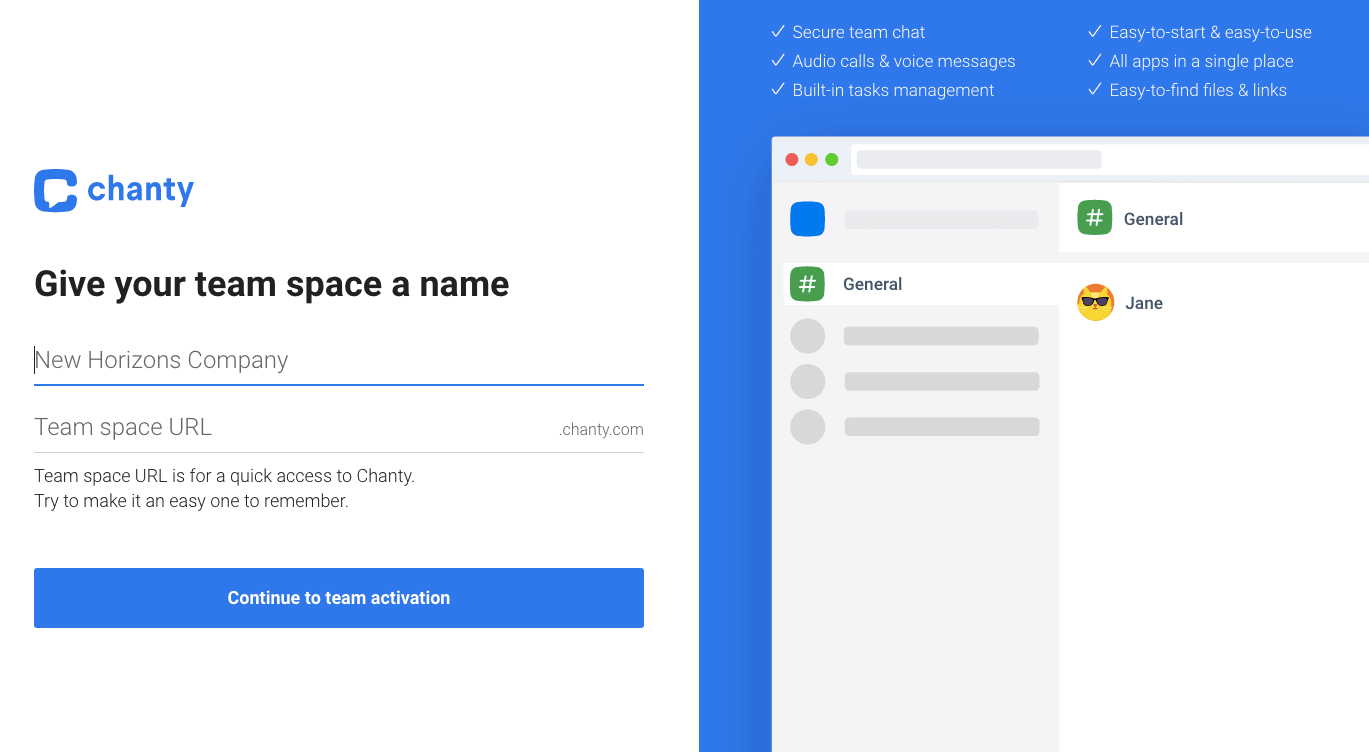
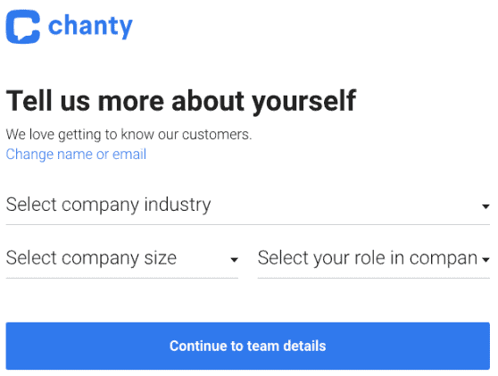
It was our initial signup form. It’s hard to get more simple than that. However, over time, we decided to add an additional step to it to gather some marketing information that was absolutely critical for us. It is self-segmenting questions that help us autofill data:
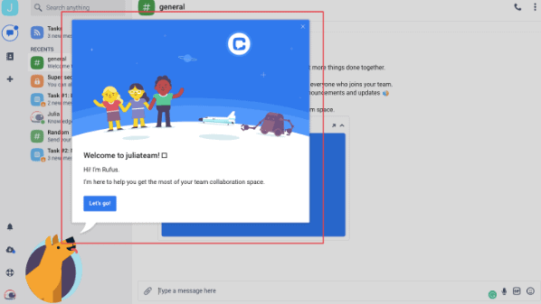
Here you can take a look at a welcome message during the first login:
However, while our simple signup was cool, our main goal was to support users in the long run. And here comes the need to incorporate a product tour into your onboarding workflow. Product tours give your community on-demand lessons on using your app. Let’s dive deeper into the Chanty product tour in the next section.
Guide Users Through Your App With a Product Tour
Too many features. Too little time. What should you show users on a product tour? How and when should you explain the rest of the tool functionality? There are different ways to present product tutorials, from the in-app “Getting Started” checklist to tutorial buttons alongside different features.
The product tour we did for Chanty has taught us a few valuable lessons:
- Your product tour should consist of five tips maximum – New users can’t wait to start benefiting from your app. Make sure that your product tour isn’t overlong in order to respect their time. Less is more—many steps only add friction. So, remove distractions, and guide your users in the most direct way possible. Three to five steps is enough for your onboarding flow.
- Your product tour should take less than 40 seconds to complete – People tend to skip long-tailored product onboarding tours and explore the product on their own.
- Your product tour should be user-driven and skippable – It’s a bad idea to force users to do anything. Instead, let them navigate easily through your app, to the right place, with a ‘Next’ button.
- Allow users to revisit the product tour again when they are ready for it – Again, don’t force users to take the product tour. Chances are they want to explore the product on their own at first. Maybe, they will return to the tour later. Just leave open the possibility to revisit the product tour again.
- Don’t try to show all the features – Resist the urge to show off all of your most advanced features at once. New users will have more chances to recognize the value of your app if you stick with the basic features. The most sophisticated capabilities of your software may not fit the average user’s needs. Explaining every nook and cranny of your app will only lead to annoyed users. Considering that, highlight only the features that represent your product’s core value. Additional features can be introduced later.
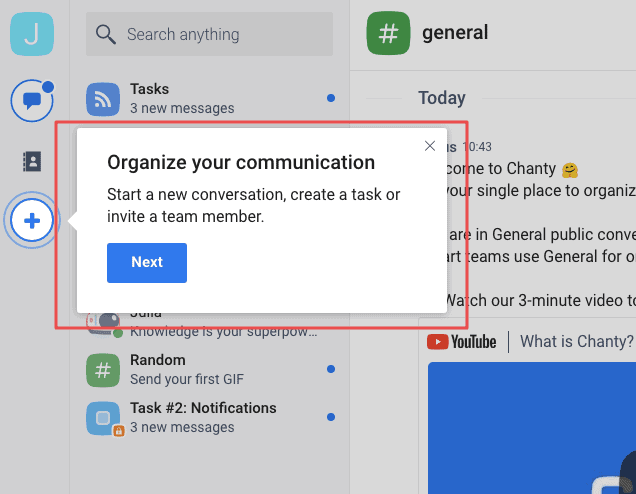
Don’t be afraid to be playful: Experiment. Test different user interface elements, shapes, colors, sizes, etc. Here is what our product tour looks like:
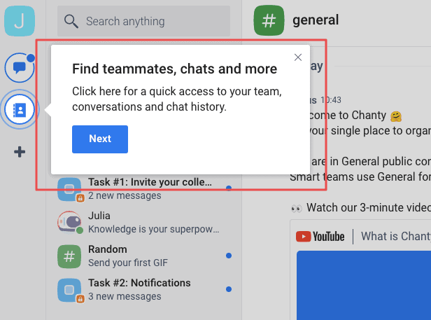
When the short product tour is over, how do you seamlessly highlight other important features of your product? Addressing this challenge, we have incorporated gamification into our app because the whopping numbers show that gamification can lead to a 150% increase in engagement metrics. What’s more, adding game-like elements to a training experience engages users and motivates them to continue learning.
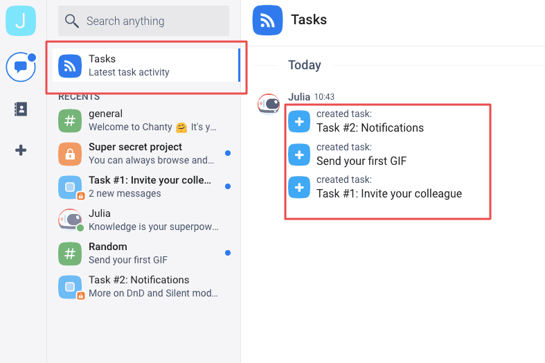
As a result, the product tour is “extended” so that users don’t hate it. Exploring the “Tasks” feature, users find the tasks for them. Completing these small tasks, they learn more about Chanty features:
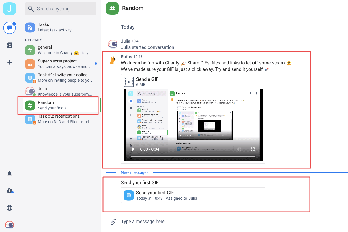
What’s more, we’ve created a dedicated video for every important feature we want to highlight:
Onboard and Educate Users With Emails
Emails are a powerful tool when it comes to customer onboarding. However, there’s a question: how to make truly valuable onboarding email campaigns and avoid flooding your potential customers? The answer is quite simple: The emails you send should really help your users. Period.
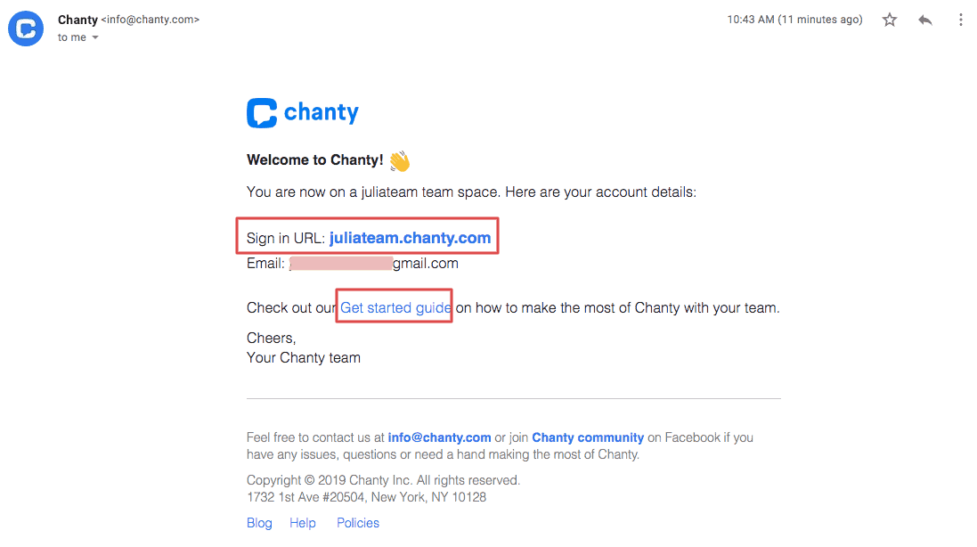
Here’s the welcome email we usually send. In this email, you will find nothing excessive. Only account details and a link to the documentation:
Once we’ve sent the welcome emails, it’s time to move forward to educational ones that explain the value our top features deliver to keep our new users engaged and educated. While crafting the educational emails, we stick to the ground rule “One concept/feature per email.” Too much information or too many features may confuse users. Instead, let them take a single step at a time with a single and persuasive call to action per email. That will dramatically increase user engagement.
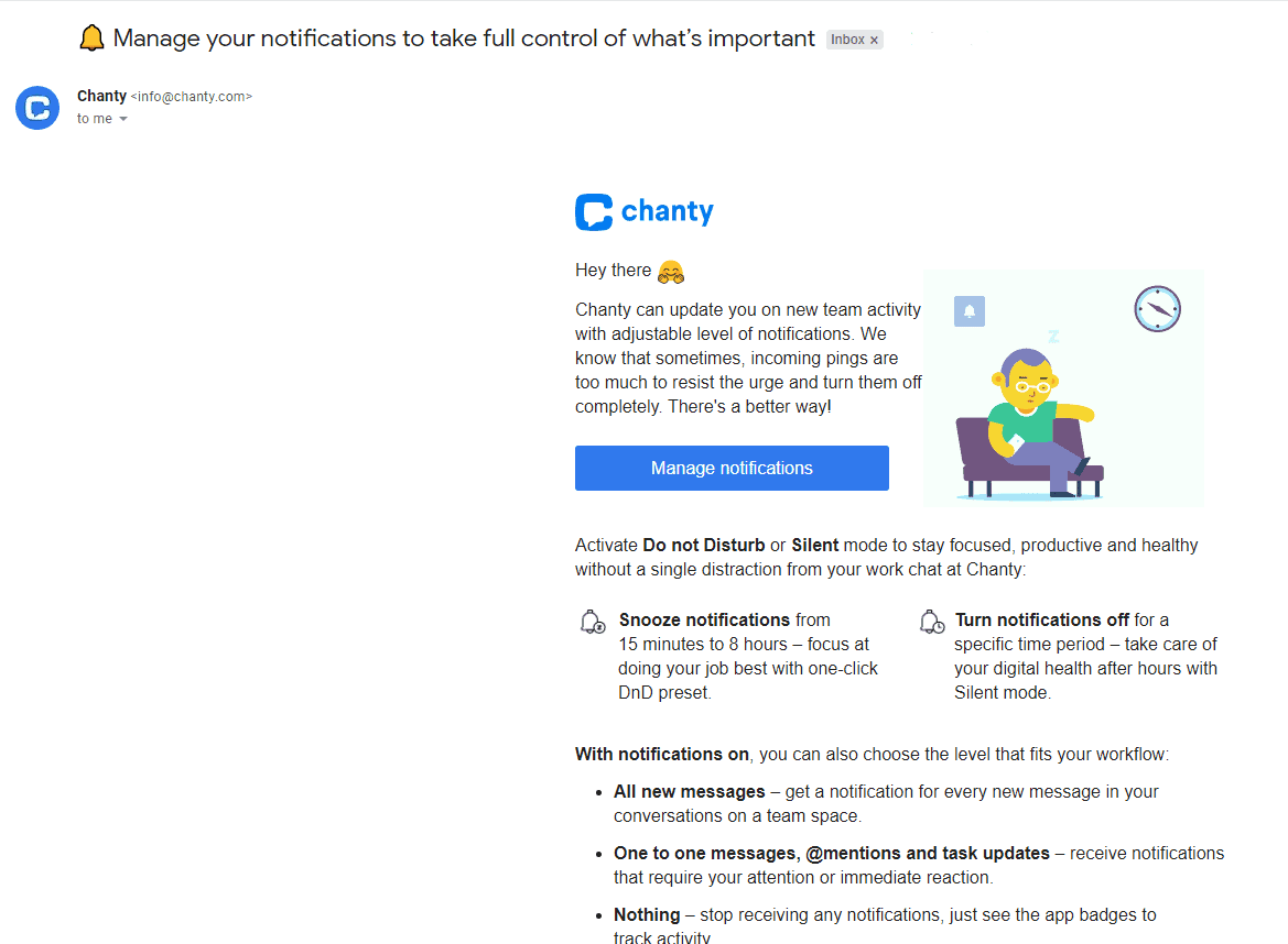
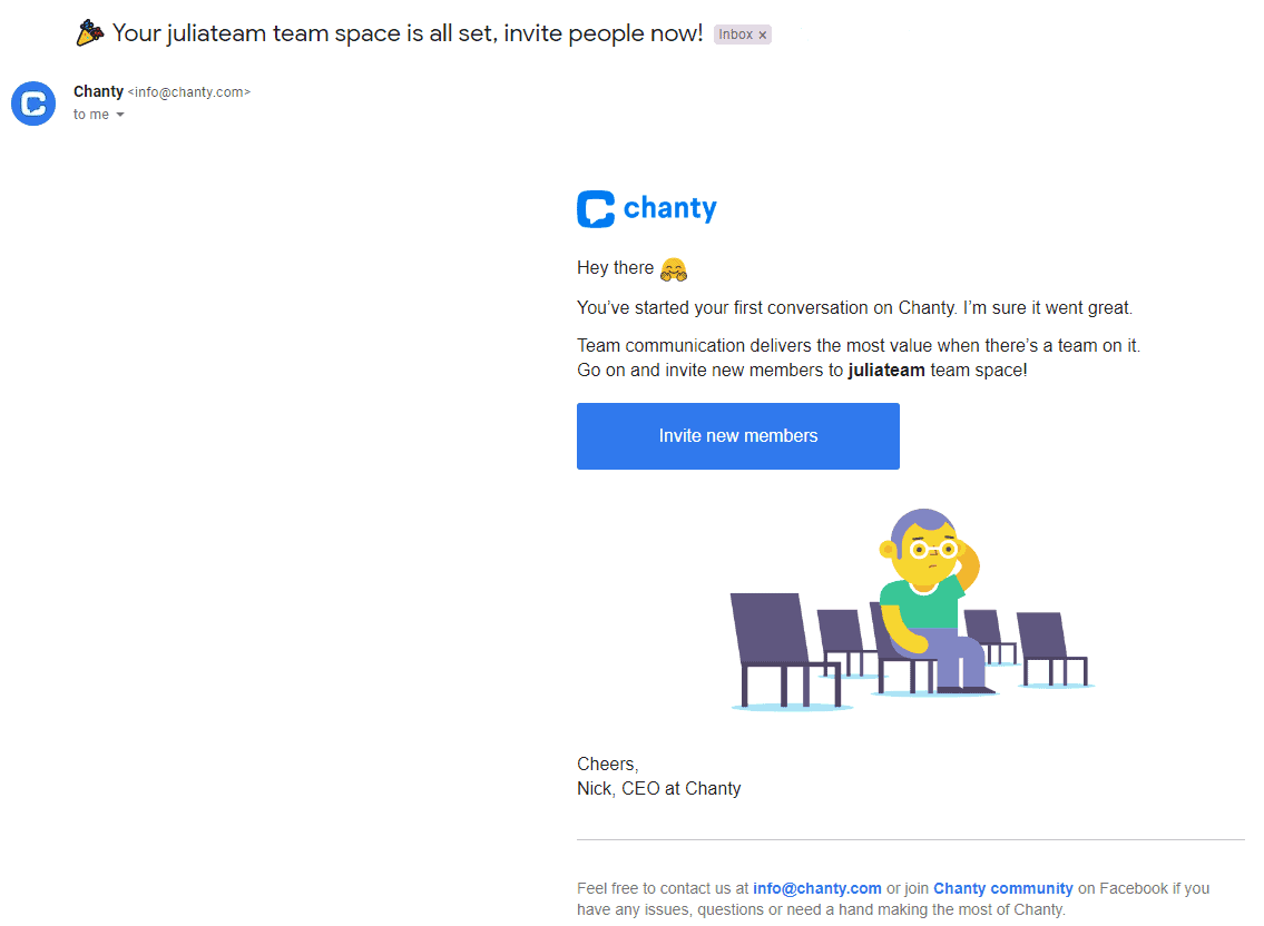
There is a list of tested-and-tried tips that have helped us to craft truly engaging educational emails:
- Keep it simple – Onboarding emails don’t have to be super short. However, they should be super easy to digest. Crafting Chanty’s emails, we were asking ourselves constantly “Can our users understand the main message of the emails in two seconds?”
- Introduce just one new concept and CTA per email – That will help you effectively draw new users into deeper engagement with your app.
- Make your onboarding emails personalized by adding behavior-based triggers – In doing so, you’ll create messages that are more relevant than generic time-based emails. Personalizing your emails to user experience, you’ll see up to a 100.95% higher click-through rate and 18x more revenue.
Document Essential Things
Skip this step if you are only at the start of creating the onboarding process. But if you are ready and have enough time and resources, you should know that documentation is an important element of any onboarding experience. If everything goes great, your documentation center won’t be needed at all. Nevertheless, easily accessible and understandable documentation helps you be sure that when users are really stuck, they can get guidance.
Chanty’s Outcome After Incorporating the User Onboarding Flow
The process of tweaking every nook and cranny of customer onboarding leaves you a lot of space for testing and further improvements. The sky’s the limit for testing: You can vary your approach to different user groups; change channels where you deliver your information; make separate onboarding flows for web, desktop, and mobile apps; etc.
There are a few onboarding metrics we managed to improve with the help of onboarding:
- How often users are logging in. This metric was doubled.
- How long they stay logged in. Users stayed logged in an average of 50 minutes longer.
- How many features they are using. The number of features an average user adopts has increased by 35%.
These metrics are critical for every SaaS business. The reason is simple: If users don’t spend enough time in your app and don’t use the features you offer, they won’t understand the value of your app. And eventually, they won’t buy it.
And that’s aside from the rate at which users convert into paying clients. The main guarantee of our success is continuous optimization and thorough in-app analytics. To name a few more inspirational examples, Pinterest saw a huge increase in customer activation and up to a 10% increase in people who come back with the help of user experience personalization. Tweaking the progress indicator clearer that caused user churn earlier, Intercom experienced a 12% increase in people who have passed through one of the most crucial steps in their onboarding process.
Make Our Lessons Learned Work for You
They say you have only one chance to make the first impression. With the help of thought-out customer onboarding, we have not only drawn users’ attention to our team chat but also made them stay with us. But it’s a hard job. Here are the key lessons we’ve learned:
- Deliver value. The main goal is to show the value the product delivers and to encourage the customers to use it.
- Analyze competitors. Research on best practices will give you ideas on where to start and things to avoid.
- Break the onboarding process into separate workflows.
- Focus on what’s important. Don’t try to do everything at once.
- Keep onboarding as simple as possible. The simpler, the better.
- Test, experiment, and optimize. Choose a metric that is crucial for your business, and optimize your onboarding to get better results.
In addition, there are many great how-to articles, whitepapers, and resources on how to make every bit of customer onboarding flow.
You could look at examples of onboarding from the 10 top software companies featured by Groove or look at 50+ reviews of onboarding processes incorporated in different companies. Smartsheet can help you with a checklist for your onboarding, and this CXL article talks about testing your onboarding. There are lists of useful resources and tips in Appcues and Userpilot blog posts.
What’s worked for us can work for you, too. If you follow these best practices, you’ll see more users stick around and become long-term customers.
What are your thoughts on customer onboarding flow? Are there any tips that have worked for you?


