 “Writing is easy. All you have to do is cross out the wrong words.” — Mark Twain
The irony is not lost on me that this is a long-form text guide on how to write visual end-user guides. I initially considered offering this as a visual document instead of a blog post, but the truth is that some ideas are best communicated via text.
I have seen too much bad end-user documentation over the years, and I have fixed many end-user guides for software written for internal users.
I have heard complaints from users that the software or solution in question is not user friendly. While this post is not about good UI/UX design, many times the technical writers writing the end-user guide contribute to the strain of the end user.
These technical writers may not be the ones who developed the software, so they are likely not to have input on the UI/UX design. Still, they can alleviate some of the end users’ burden by writing decent visual guides.
In recent years, there has been a proliferation of software and tools behind corporate firewalls, and some of the guides I have seen are rather cringeworthy. Some “gems” I have seen over the years include:
- Click where it says “Click Here”
- Please wait while the screen is finishing loading
- “How To Find This Document” (If I am reading it, haven’t I found it already?)
- Do not click “Cancel”
In this post, I am going to show you how to write a visual end-user guide that is easy to read and uses visuals and diagrams to guide the user on how to use your software, section by section. I get that software developers don’t like writing non-code. However, if you want your software to be liked, writing a good end-user guide is an essential skill even if all you do is help the tech writer.
Before I actually begin, let me emphasize that good technical writing is not about getting people to read your document but to skip your document. You don’t want anyone to have to read any part of your document they don’t absolutely have to, so keep this basic principle in mind when writing your guides and the rest of this post will make a lot more sense.
Writing the Title Page
The first visual element in your guide is your title page. This is where your process of elimination should begin.Your first process of elimination is to weed out those people who don’t need to read the document and attract those who do.
Because of this, you need to include a publication date on your title page. This will help the reader determine if the publication is too old or too new for the area of software they are trying to study.
The user should be able to read the title and publication date and determine whether or not they want to read the document.
Remember, your document will get emailed around, published on the corporate intranet, and linked from the software.
For that reason, include a logo for your software to act as a visual marker for anyone that may be interested in the document. Also include a descriptive title so that if someone were to read it, they could determine if they should read further.
Some bad sample titles include:
- End-User Guide (end-user guide to what software?)
- How-to Guide
- User Release Notes
Good titles include:
- End-User Guide for Legal Department (How to Perform Reviews of Legal Memorandums)
- How to Perform Legal Reviews of Memorandums in the Legal Documents Review System
- User Guide to Performing Legal Review of Customer Memorandums in Document Review System
Notice each title tells the user you don’t need to read this if you are not in the legal department. You don’t need to read this if you are not performing a legal review, and if you are not involved in the legal review of customer memorandums, you will not find this guide useful.
Remember the process of elimination? You should be getting rid of the uninterested users right from the title page.
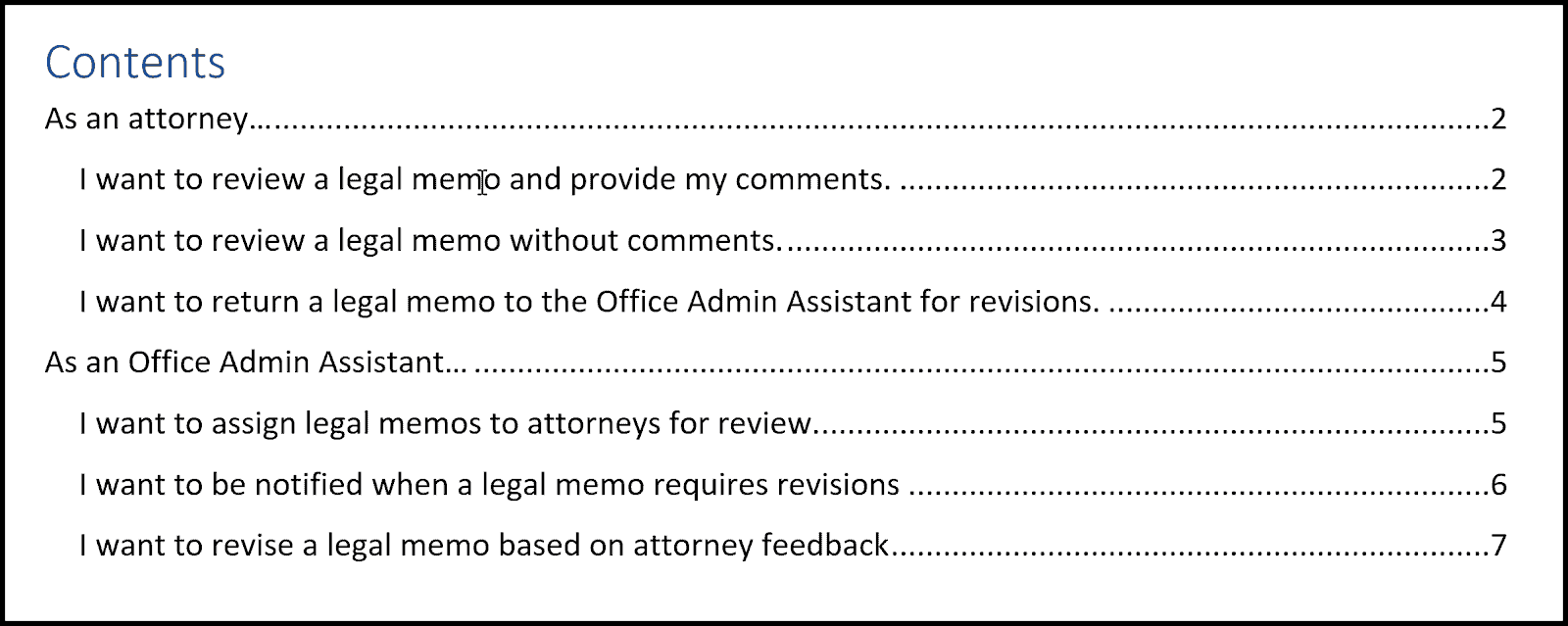
Table of Contents
I prefer to write the table of contents (TOC) before I write the rest of the document. Most modern word processors create a table of contents for you, but writing one yourself ahead of time has multiple benefits. It gives you a roadmap of what you should write and helps organize your thoughts.
The table of contents is also the second visual element of your guide. I know that it consists mostly of text, but the text, the indentation, the grouping, and font all matter in terms of aesthetics.
In writing a good table of contents, the stories of the software in question should be your guide.
Write each section as you would start a user story.
Take this opening statement for example, “As an attorney, I would like to …”
This tells the user that if they are not an attorney, they should skip that section, as it will have little to no benefit for them.
Also, the order of the sections matters. You should write the stories in the order of the number of users. For example, if there are more attorneys who will be using the software, you should write the attorney section first, then the most important user populations, and so on.
For each subsection, write the sentence as you would in a story similar to what the user would like to accomplish.
Since your section started with “As an attorney I would like to …,” each subsection should refer to what the attorney would like to do, such as “review a document in my queue” or “return a document in my queue to the office administrator for further edits,” etc.
Again, each subsection should be in the order the user is most likely to perform tasks. If an attorney is most likely to perform task A, it should be first, and then task B, and so on.
The table of contents should be limited to two pages. If you have more than two pages of contents, perhaps you should consider splitting the guide. For example three separate guides for three separate personas/users. This way, you’re still able to discuss all aspects of your software in an easy-to-follow way.
If you are familiar with Agile, you will be familiar with user stories and epics. Use the personas you developed in your stories and the goals each persona would like to accomplish as a guide to writing the section headers.
Use the process of elimination. Wear the users shoes. Reading your guide is not their job; they just need to perform a task and get back to their regular job, so it should be easy for them to find what they need.
The visual cues to provide in your TOC are:
- Clear grouping of tasks to be accomplished by a single persona
- Separation of personas by section
- Clear hierarchy of the tasks (most frequent first)
A table of figures (TOF) is another important visual element, and yes, it is a visual representation of visual elements.
Not every screenshot in your document deserves a citation in the table of figures. Include only those screenshots in the TOF that are of particular importance. Perhaps a process flow or a schematic of a part.
Section
Each section and subsection should be written as: “As a persona, I would like to accomplish my goal.”
As each subsection should be titled with the goal the person would like to accomplish, write each subsection with the steps the user must take in order to accomplish that goal.
Never assume that a user knows something or has done something up to that point. Assume the user has never used the system, and assume that the user has done nothing.
If there are pre-steps to performing the tasks, provide a link to the section for performing those pre-steps. For example, how to log in to the system. If you don’t have a login, how to request access to the system. Never assume that a user has done those steps already. Tell them where to look for that information.
Always provide all the information in the document, every minute detail. For example, include the URL to the system, and don’t assume the user knows it.
Remember that this is a visual guide. Even the way you breakup the steps must be a visual cue to the reader.
Start each subsection with steps. Each step should consist of two complementary pieces, the text and the screenshot. The text is a visual complement to the screenshots while the screenshots are visual complements to the text.
Text
The text for each step should contain the steps numbered 1, 2, 3, etc. and contain text instructions on how to accomplish the task. This will help the reader keep track of each step, giving them a number to refer back to when they’ve stopped.
I always like to do the task in question while I write so I don’t skip any steps.
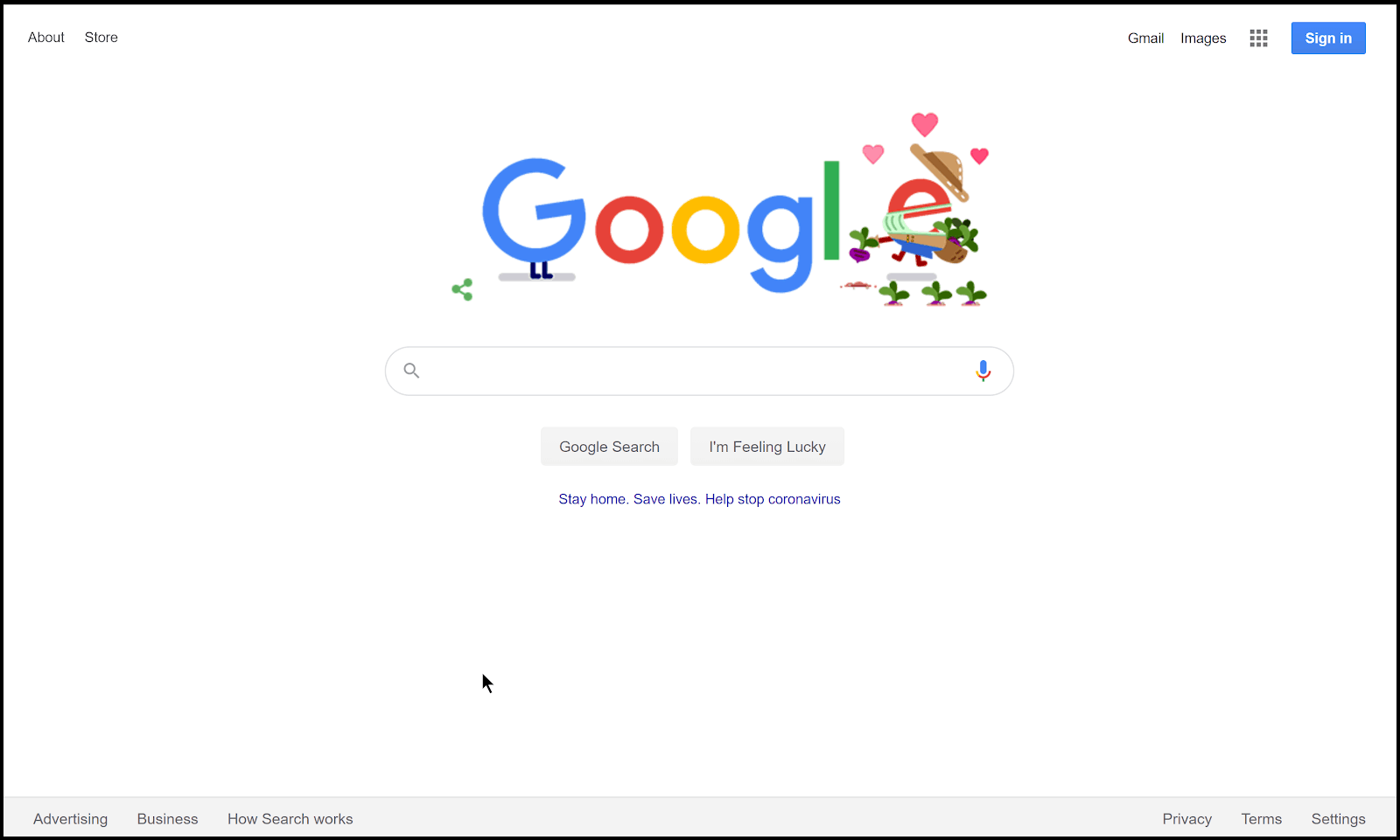
- Navigate to the homepage of the site by clicking the following URL:
http://www.google.com
Remember to never assume. The user may not know the URL to Google (yes, really).
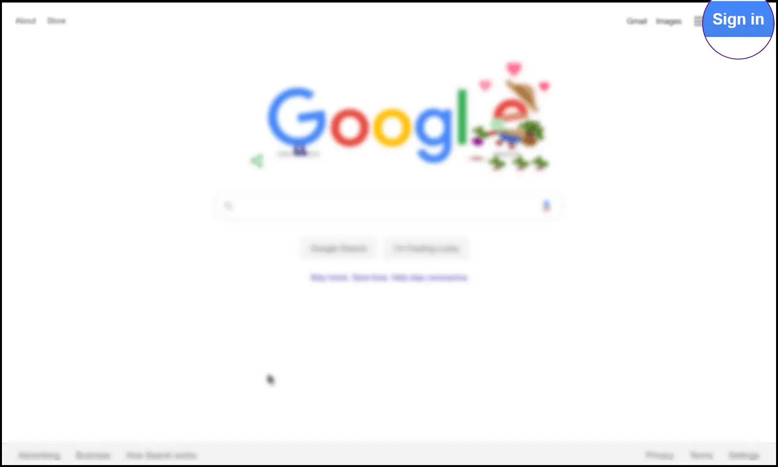
Bonus points if you include small screenshots within the text.
This text is good:
- Click the “Sign in” button.
This is better:
- Click the
 button.
This provides an inline visual cue for the reader, allowing them to see exactly what they’ll be looking for.
Screenshots
Each screenshot should have a border. The user must be able to tell visually where your screenshot ends and the document begins, especially if the screenshot and the document have the same background color.
Have you ever read a document where the screenshots and the page are the same color? I have read too many, and it is quite an assault on the eyes. So be kind to your reader so that they can visually tell where everything starts and ends.
The screenshot should give the user context and visual cues of where they need to focus. It is not good enough that you included the screenshot; you must now focus the user. There are multiple strategies for doing this. My favorite screenshotting tool is SnagIt. You can:
- Blur the rest of the image.

- Magnify the section the user must focus on in that step.
- Provide an arrow to the area.
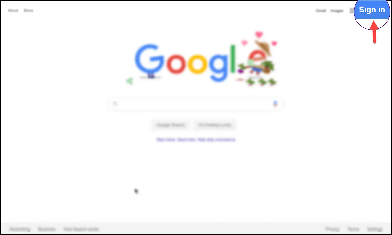
Or a combination thereof. Remember, you want to provide as many visual cues as necessary to make it easy for the user. However, use effects sparingly, and use your best judgment. My rule of thumb is three effects should suffice to focus the user’s attention. Any more just distracts from the screenshots.
Each step and its associated screenshot should be indented to the same level. If there are substeps, the screenshot of the substep should be indented to the substep.
Since this guide is about making it visual, you should have enough screenshots such that if all the text in the document was not there, the user should be able to accomplish the task just by looking at the screenshots.
You want the user to be able to understand exactly what they need to do without having to read any of the text. That’s how many screenshots you should have, as many as it takes. One trick while in the editing stage is to turn the text white, and see if you can still follow the screenshots without any text help to accomplish the task.
In connection with that, the text should also be written without the screenshots in mind. Delete the screenshots, and see if you can follow the instructions and accomplish the task with text only.
Both should be easy to follow so that any person of any skill range can complete the task. If you’re not quite sure of your text’s difficulty, you can always ask a friend to read it over for you, preferably someone who doesn’t understand the material, and see if they can grasp what is going on. If they can understand it, then you’re good!
Keep It Simple, Silly
In summary, write software guides with a visual title page, a great description, a table of contents, and clear sections.
Write the table of contents in persona form such that if a user is not that persona, they can skip that section and focus only on the section they need to read to accomplish their task.
In each section, include all the text and screenshots the user will need to accomplish the task, and ideally, do the task while writing the guide so you don’t miss anything.
By doing this, you just might reduce some of the burden from end-users, and they will thank you for it.

Related Articles

12 REALITIES of Daily Life as a Programmer
What’s the daily life of a programmer like? A programmer’s daily life consists of auditing and debugging code, coding new…

13 POWERFUL Productivity Tips for Developers
Great productivity is one of the best soft skills you can have as a developer. I’ve used these tips to…
Impostor Syndrome as a Programmer
Believing that you’re somewhat unqualified for your job is a problem faced by the best of us. When those thoughts…