 Apps are not just conventional tech products anymore. Just like smartphones, they have become a major part of our everyday lives. Funded lavishly, designed ultimately, and marketed carefully, they have become the mainstay of the modern connected world, especially mobile health or mhealth apps.
Currently, the app stores boast a reasonable number of mobile health (mHealth) apps. The Google play store has 53,054 mhealth apps, while Apple App Store has 53,979. Look at this chart by Statista which says that app stores witnessed a 65% increase in medical app downloads during the pandemic in 2020.
So it’s not a stretch to say from this point on that Mobile health (mHealth) apps are the future of the healthcare industry.
However, for all the potential benefits these tools offer, the adoption rate of mhealth apps is pathetic. Most users stop using them after a few times of use.
According to a widely quoted survey by research2guidance, only 7% of mhealth apps have more than 50,000 monthly active users. Nearly eight out of nine diabetic patients own a smartphone, yet only three use diabetes apps. More to the point, over 1 billion people suffer from chronic respiratory diseases globally, yet far less than 1% of this target group use mobile health apps.
In other words, the high download rates of mhealth apps aren’t synonymous with high adoption rates. The evident conclusion is that healthcare apps don’t align with their users’ needs and expectations.
In this post I’ll explain how to accelerate the adoption of mhealth apps, by incorporating patient-centric features, that is, features that are consistent with the users’ needs.
What Do You Mean By Patient-centric Features in a mHealth app?
Broadly speaking, what a given healthcare developer reckons as a great feature may be irrelevant from the patients’ point of view. Say, for instance, the developer designs multiple columns within the app and desires that the patients fill them to receive the proper medications in return. The problem: Apps that require heavy manual data entry through multiple screens and steps don’t go down well with patients as they would hardly be able to complete even the basic tasks.
Another possible wrench into the works cited by patients is unclear (or lack of) explanations from the developers’ end, which results in incomplete tasks.
For instance, in most diabetes apps, users are known to complete only part of their tasks, such as entering glucose levels more. Soon, they feel lost and helpless as they fail to fill the majority of the blanks without assistance. According to a study, participants completed only 79 out of 185 tasks (43%), across 11 apps, without help.
The point I am hammering home is: When you are developing an app for patients, make it patient-centric. In other words, look through their eyes. Speak to them. Uncover their wants and how they intend to use the app. Find out what features, according to them, will make them want to use your app. It stands to reason that by keeping your patients central to your apps, you will, in a way be ensuring that your patients stick to the app in the long run.
On the other hand, if your app is already out there, check out app store reviews. If there are any complaints, remedy them. Suppose you have any doubts about the efficacy of certain features, rope in an app development company with a reputation for engineering successful mhealth apps. In doing so, you’ll rest assured that your app is in good hands, and the final results are as per your liking.
Essential Features of a mHealth App
To truly have a patient-centric mhealth app, certain features should be considered make-or-break; in other words, essential. Here are some of them.
Direct Interaction with the Health Care Practitioner (HCP)
I know; it seems to be an overarching tip considering that doctors are known for their packed schedules, especially in the light of the pandemic. But the fact remains: Enabling real-time communication between patients and doctors can guarantee a higher user retention rate, especially when people prefer to stay at home in the current scenario.
Imagine a doctor sharing test results via an app and, in return prompting feedback from the patients. Unarguably, real-time video chats, texts, and voice messages prompt behavior changes in the user, resulting in better app engagement and retention.
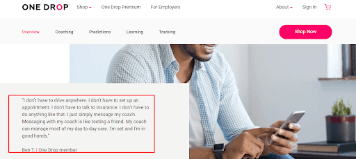
ONE DROP app offers daily personalized coaching services to its members in addition to health predictions and more for type 1 diabetes, type 2 diabetes, prediabetes, high blood pressure, and high cholesterol to help patients improve their health. ONE DROP aims to revolutionize the doctor-patient relationship with its direct one-to-one coaching services.
Here is one testimony by One Drop app users that reveals what users love about this app.
Clean and Simple Dashboards
In other words, avoid “Feature Creep.” According to Dan and Cheap Heath in their classic book, “Made to Stick,” most technology and product-design projects must combat “feature creep.” Put another way; it is the tendency to make things incrementally more complex until they no longer perform their original functions very well. When your remote control has fifty buttons, you can’t change the channel anymore.
Simply put, avoid overloading your dashboard with features, instead set up clean and simple dashboards. By doing so, critical elements of the app will flash like neon lights grabbing user eyeballs. By highlighting the best features of your app, you enable users to master them. Such kinds of dashboards are ideal for fitness and health management apps.
Typically, fitness or health apps should mainly have activity feeds in their dashboards that users could use to track their health-related goals. It could be related to rehab exercises or whether or not they had taken medication pills that day.
Additionally, the dashboard should have user tracking data, recovery progress, alongside visual health records. Such health records are handy, as a doctor or a patient could instantly look them up for information, and given that they are in a graphic format, it is easier for the human brain to retain information.
The best part is it’s easier for developers to create such dashboards, and at the same time, it drives behavior change and helps re-engage users.
One of the participants of the National Center for Biotechnology Information survey shared the following thought about Dashboards: “I liked the way the dashboard looked. It was just so clean, and so I said, ‘Alright well, I’ll download that and give it a try!’ and I’ve been really happy with it.”
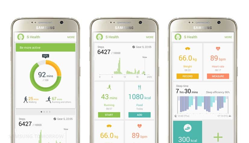
The dashboard of Samsung Health is both colorful and very user-friendly.
Succinct and Simple Language
It’s common knowledge that health care practitioners use complicated terminologies, often containing Greek and Latin. In healthcare, the language you use can proverbially make or break your app. So make sure the language is simple enough to strike the perfect chord with users.
Conversa Health, a mobile platform for virtual healthcare, is living up to its punchline “Better Conversations, Better Care” by using relatable and succinct language throughout the app. The company takes it a step further by collaborating with psychologists to add in words that encourage patients to continue using the app.
Personalize Notifications
Personal notifications, if anything, help build a thriving community around your apps. It gives a clear direction of the following steps and thereby prompts disciplined behavior among the users. In mHealth apps, users should be able to customize their notifications as per their specific health goals and circumstances.
Mango Health enables patients to set up personalized reminders and alerts for all sorts of health goals such as staying hydrated, taking medications on time, and even reminding themselves to undertake blood pressure checks. Users earn points if they take their medicines on time.
Be Upfront About the Cost
Not revealing the exact cost of the app is also one of the major limitations that make users lose interest in your healthcare app. In fact, 36.1% of patients cited hidden and unexpected costs as being the reason behind app discontinuance. The ideal way to remedy this issue is to be upfront about the features that are available for free and those that require payments.
Remember this: People will readily pay for apps if they bring about positive changes in their lives. On the other hand, if you offer your app for free but force users to make payments to utilize the features, you will likely alienate many of your users. Be clear-cut about the cost as users won’t like surprise fees.
Keep Patient Needs Central to Make your mHealth Apps Stickier
Developing, deploying, and prompting patients to download a mHealth app is the easier part. The hard part is to make it likable so that patients don’t stop using it after a few times.
Adding patient-centric features is key to this. From aligning with user needs and direct interaction with the HCPs to using clear and succinct language and from enabling personalized reminders to developing clutter-free dashboards are some of the sure-fire strategies to ensure continued use of your apps in the longer run.
So, gearing towards rolling out a mHealth app this year? Make it patient-centric. Pronto!

Related Articles
5G App Development: How To Prepare for the Future of the Internet
5G is the fifth generation of broadband cellular mobile networks and is expected to bring a huge change in the…
Steps to Follow during IoT App Development—Its Ultimate Business Value
Companies who dream of staying ahead of the competition look for ways to achieve the aspect faster by inculcating innovations.…

Best Practices for Mobile UX Designs
As per a report compiled by Statista in 2021, the number of mobile users worldwide stood at 7.1 billion. It…