Being an inseparable part of 3.48 million apps on Google Play Store or 2.22 million on App Store feels good. Whether it is an Android user or an iOS user, people have plenty of options for downloading the mobile applications they desire.
App categories like medical apps, entertainment apps, finances/business apps, social media apps, etc., are some top categories with many downloads. If yours is an app from the above categories, it should have hundreds or thousands of downloads, right?
However, what if a mobile app fails to bag sufficient downloads? What could be the possible reason behind it? You might blame the overall mobile app design and development, graphics, or anything else.
The truth is, there are several reasons for users to uninstall a mobile app that doesn’t serve its purpose, but a poor UX design is one common reason. And guess what: There are more common UX mistakes that impact the user experience and user’s interaction with a product.
So read on and find out some common UX design mistakes, as well as how to avoid them.
Why Does User Experience Matter?
Before I show you the most common UX design mistakes, it is essential to know why UX design is important for a mobile application or website.
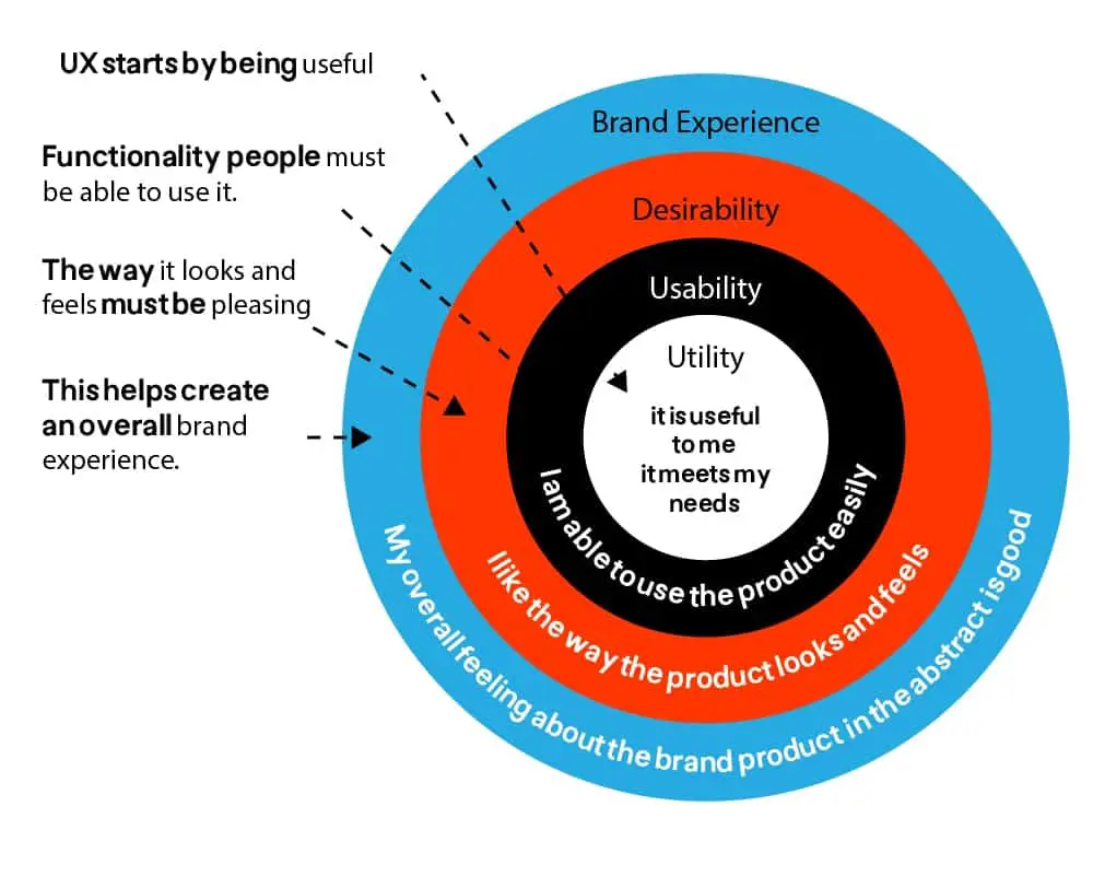
Put simply, UX matters because it is devised to fulfill everything a user is looking for. The key aim of UX design is to provide a seamless experience to users so that the conversion and retention rates increase.
When done rightly, a brand/organization can save a lot of time and money at every stage of visual design.
If users are able to navigate your mobile app or website easily, congratulations; you’ve successfully offered a great experience to them. Hence, the importance of UX design should never be underestimated.
UX Design Mistakes
And now, having seen the importance of UX design, let’s take a look at some UX design mistakes that no one should commit.
Ignoring Users’ Feedback
The majority of companies and organizations, having a mobile app, always listen to their users. Paying heed to the user feedback allows for optimizing the app during the product design stage. This saves a lot of time and money.
Users judge the app in real-time and better than developers or designers. That’s the key reason why social media giants like Facebook (now Meta), WhatsApp, and Instagram have evolved and look different from previous versions.
Copycat Features
There’s always room for new apps in the market because users expect some new features. By integrating new features, a mobile app becomes unique. Nonetheless, UX designers often make a blunder by integrating similar features of a popular app.
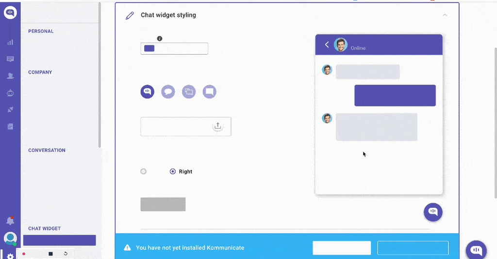
Imitation can be jeopardizing for a mobile app or website. For example, JioChat is a replica of WhatsApp. It has the same UI design including colors and exact features.

However, users often complain about JioChat having issues like getting crashed, delayed messaging, lack of smooth onboarding, etc.. Due to such hurdles, the messaging app has drastically lost a lot of users.
Lack of Responsiveness
Exclusion of responsiveness from the mobile app is the easiest way to the pitfall. If the UX design fails to be responsive, users cannot access the app. Hence, a user experience designer should never overlook the responsiveness of an app.
Responsive design is one of the key elements of a mobile app. All mobile applications with a responsive design should be compatible with different screen sizes and display graphics without distortion.
A responsive design brings in benefits for the brand. Some of the biggest advantages of building a mobile app with responsive design include reduced bounce rate, increased conversions, improved rankings, and more.
Aesthetics Over Functionality
A quote by Jana Kingsford says that Balance is not something you find; it’s something you create. Though UX designers assure striking a balance between aesthetics and functionality, some either miss it by chance or intentionally avoid it.
Preferring looks over functionality is another common UX design mistake. Functionality should be a UX designer’s top priority which should sync with the aesthetics of the app. Focusing on not committing the mistake of prioritizing looks over aesthetics would resolve the problem of UX design.
Zero Usability Testing
UX designers cannot evaluate upgrading or optimizing the app. Professional user researchers should be approached for performing basic-level user testing for figuring out flaws in the initial development stages. However, experts emphasize performing usability testing by including a real target audience.
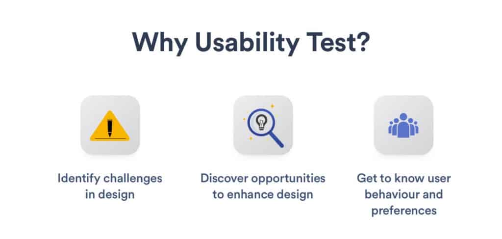
Users should be able to smoothly perform basic tasks like registration, logging in, searching, etc., depending on the features offered in the mobile application. Avoiding this stage would drag back the UX development to its initial stage.
No Negative Space
Gone are the days when negative space was regarded as a negative element. Today, negative space or white space has become an essential element in UX and UI design.
Instead of overwhelming your users with graphics in excess, leaving some white space would be a wise decision because it will make the app look less cluttered.
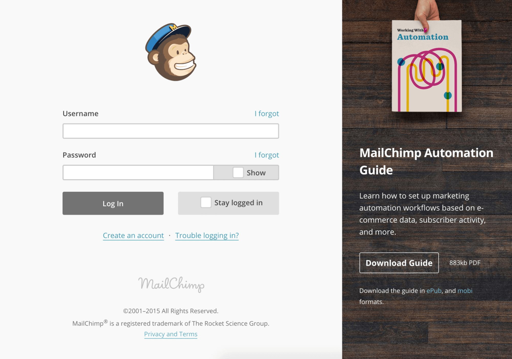
Mailchimp is a great example when it comes to utilizing white space. Strategically placed buttons and non-overwhelming graphics make it less complex for users to understand.
Too Much Information
Content is king. Though this is the unspoken rule that applies to both UX and UI designing, it works best when done in a balanced way! UX designers must pay heed to the amount of content that would be displayed to the user.
There shouldn’t be verbiage that overwhelms. Moreover, it is recommended not to include lorem ipsum because such content makes things look out of place. If there’s no information or detail available, it is better to leave the space untouched. The inclusion of dummy text misleads the user which isn’t considered good for website or app conversion rates.
The UX design of an app should be visually appealing and, at the same time, convey the message concisely. Even the description for digital products should be concise and relevant to the imagery and features, so that a user can relate.
It’s Never Too Late to Correct a Mistake!
So, here we have it. Developing a mobile app will not be a tough nut to crack when a UX designer abides by the UX designing trends, ethics, and principles. The key aim of a mobile app is to communicate with its users and offer what they’re looking for instead of confusing them.
When the roadmap for mobile app UX design is designed correctly, the chances of committing common UX design mistakes are curbed.

Related Articles

5G App Development: How To Prepare for the Future of the Internet
5G is the fifth generation of broadband cellular mobile networks and is expected to bring a huge change in the…

Steps to Follow during IoT App Development—Its Ultimate Business Value
Companies who dream of staying ahead of the competition look for ways to achieve the aspect faster by inculcating innovations.…

Best Practices for Mobile UX Designs
As per a report compiled by Statista in 2021, the number of mobile users worldwide stood at 7.1 billion. It…