 The world of e-commerce is no longer an alienated part of retail chains. On the contrary, most would argue that it is the future of the modern retail industry. According to some recent studies, e-commerce is likely to reach nearly $4.28 trillion in sales and attain almost 22% of the total retail sales in 2021.
Budding e-commerce companies that want to tap into this growing market need to step up their game and deliver unique shopping experiences to their customers. If the prediction that 95% of retail purchases will be online by 2040 is even remotely true, e-commerce retailers have a lot of ground to cover. With the average conversion rates in e-commerce ranging between 3 and 4%, companies need to be more proactive about creating unique user experiences.
So if you are wondering how to improve customer experience on your website, here are a few proven ways that you can consider:
1. Utilize Content Delivery Networks (CDNs)
The loading speeds associated with your e-commerce website and the efficiency with which your content is displayed defines the performance of your online store. A great way to accomplish this is through a highly efficient content delivery network (CDN). CDNs are defined as clusters of servers located across the world that store content that is accessed by users on the web.
Using content delivery networks, e-commerce companies can seamlessly deliver images and multimedia files integrated into their website without having to worry about lags. All you need to do is enable content delivery networks that would cache your website content and then deliver the cached version every time the user tries to access the same webpage.
2. Use Exit-Intent Pop-Ups
One of the most proven ways to utilize exit-intent pop-ups is to enhance the user experience. Moreover, this commonly used tactic to engage website visitors offers benefits that would make the users want to stay on the website longer. There is a good chance that you have come across exit-intent pop-ups at least once in your shopping or browsing journey.
For context, take a look at the example below:
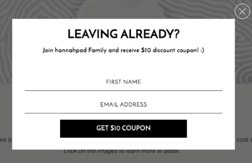
You can enable such exit-intent pop-ups to prompt the user when you know that they are about to exit the website. This would be the perfect opportunity for you to offer any exclusive discounts, offers, or freebies that would retain users on the website. Did you know that 69.5% of carts on shopping websites are abandoned? In this regard, exit-intent pop-ups can be the ideal tool for reducing cart abandonment rates.
3. Create Customer-Centric CTAs
The goal of creating a stellar user experience is always to increase conversions and sales. With this objective in mind, call-to-action (CTA) buttons are crucial elements within a purchase journey. When integrated effectively, CTAs can guide users through the buying journey and motivate them to make purchases on your website.
Placing the CTAs properly can effectively take the customer through the sales funnel and offer them clarity on the actions that should be taken going forward. Making them customer-centric should be the most important parameter that you should consider while designing your CTAs. In addition to that, you should use contrasting colors to make the buttons stand out and create actionable text to make the CTA elements more effective.
4. Ramp Up Your Mobile Commerce Efforts
One thing that you would need to consider while building a strong e-commerce presence is to make your website more mobile-friendly. Delivering a smooth user experience on mobile devices can be quite rewarding for online marketplaces. In fact, according to a recent study by eMarketer, more than 59% of e-commerce purchases are carried out on mobile devices.
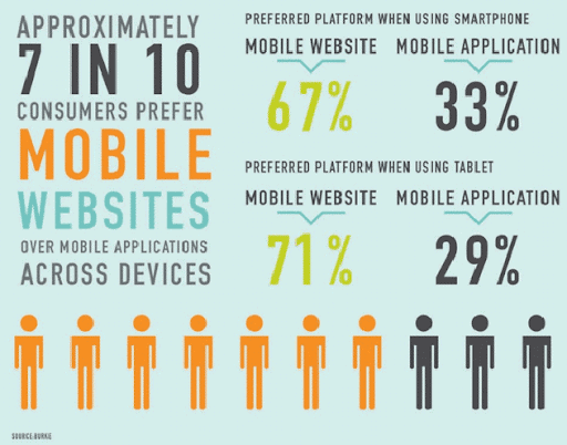
One of the biggest reasons for the rise of mobile commerce is that people tend to carry mobile devices everywhere, making it easier for you to translate their buying decisions into purchases. More importantly, digital payments also become seamless through mobile devices.
5. Enable Voice and Visual Search
People who say that voice searches and visual searches are the future are not lying. With the rising popularity of voice assistants, the demand and need for voice searches are also on the rise. In fact, if you think there is still time for you to adapt to the voice search trend, did you know that nearly 20% of Google searches are already driven by voice—thanks to mobile phones?
What’s more, with the growth and popularity projected for smart speakers and the rate at which the existing demand for them is growing, voice commerce cannot be too far behind. So, enabling voice searches will put you ahead of your competitors and give you a definite advantage in the foreseeable future.
Visual searches are defined as searches conducted by scanning products or product images instead of using the traditional textual search query. In this case, many e-commerce retailers that are already leveraging the technology can provide their customers with better suggestions and guidance during the buying journey. Moreover, enabling visual searches on your website would mean that customers can find the exact product that they are looking for more easily on your online store.
6. Maintain Content Accuracy and Quality
As an e-commerce store, you should already be focusing extensively on leveling up your content accuracy and quality. More than 82% of marketers make extensive investments in content. Content marketing is a tool that every e-commerce seller should leverage, considering the higher returns and lower investments compared to other traditional and advertising methods.
One of the primary areas of focus for you in this regard should be your product descriptions. They need to be detailed, concise, and clear in communicating information to customers, and they need to target conversions. Similarly, you need to constantly monitor and upgrade the quality of your content so that users can easily find what they are looking for.
Remember, maintaining the accuracy of your content has a lot to do with updating information in a timely fashion and ensuring that all the information that you have on your website guides the customer in the right direction.
7. Leave Breadcrumbs
If you have a large website with a comprehensive product catalog and a lot of products, there is a good chance that customers might get lost in your website. Understandably, this can not only hamper the user experience that you are trying to deliver but also make it more complicated.
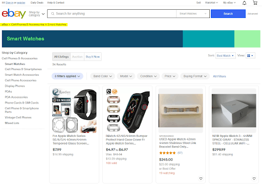
Breadcrumbs can solve this problem for you by letting the customer know their exact location on the website. When implemented effectively, breadcrumbs can reduce bounce rates, encourage browsing on the website, and offer significant SEO benefits. To understand how this can help you perform better in terms of SEO, refer to online SEO guides that can help you with the process.
Just take a look at how eBay does it:
8. Integrate Micro-Interactions
One of the prominent cardinal rules associated with e-commerce websites is that you should never take the interactivity and engagement of your website for granted. On that note, you should try to hone in on opportunities where customers can interact with the interface that you have designed.
Micro-interactions play a significant role in creating product moments that enhance the look and feel of the product for customers. One of the most popular examples of micro-interaction is the “Like” button on Facebook. Since the button enables the users to interact with the UI, it accentuates the engagement levels and subsequently, the user experience.
You can integrate micro-interactions into your website by having animations that you can hover over or adding feedback icons to product or landing pages that can add emotional appeal to your user experience.
9. Experiment With Augmented Reality
Augmented reality (AR) has revolutionized the modern shopping experience by merging technology with reality. By integrating AR, e-commerce stores can allow users to try out the products before making a purchase. More than 35% of consumers say that if they could virtually try out products, they would be more likely to shop online.
AR can enhance your user experience by facilitating more informed purchases, which can in turn reduce the bounce rate. A great example of this is the app experience put together by IKEA through IKEA Place, wherein customers can virtually play around with the products, customize them, and place them in their environment. This application aims to show customers how the product will look in their surroundings.
10. Place Appropriate Filters and Faceted Search
Filters are important elements in determining the overall user experience of online stores. It allows users to find what they are looking for much more easily and lets them personalize their selections. While most stores provide filter options, what they lack is faceted search options.
Faceted search options basically let you include combinations of different filters so that you can narrow down your search significantly while shopping on websites that have a large number of products.
In any case, e-commerce companies should start by adding basic filter options and work toward faceted search options. Also, ensure to not overwhelm your users with too many filters; otherwise, it will have the exact opposite effect that you are aiming to have.
Wrapping Up
User Experience (UX) is one of the most significant determinants of the success of your online store. A highly efficient and well-designed user experience can not only reduce the bounce rate on your website but also translate into more conversions and revenue. A stellar e-commerce user experience requires hundreds of elements and features to combine and create a unique buying journey. With these tactics, you can ensure that your store succeeds in providing the perfect user experience.

